
What is wrong with this picture?
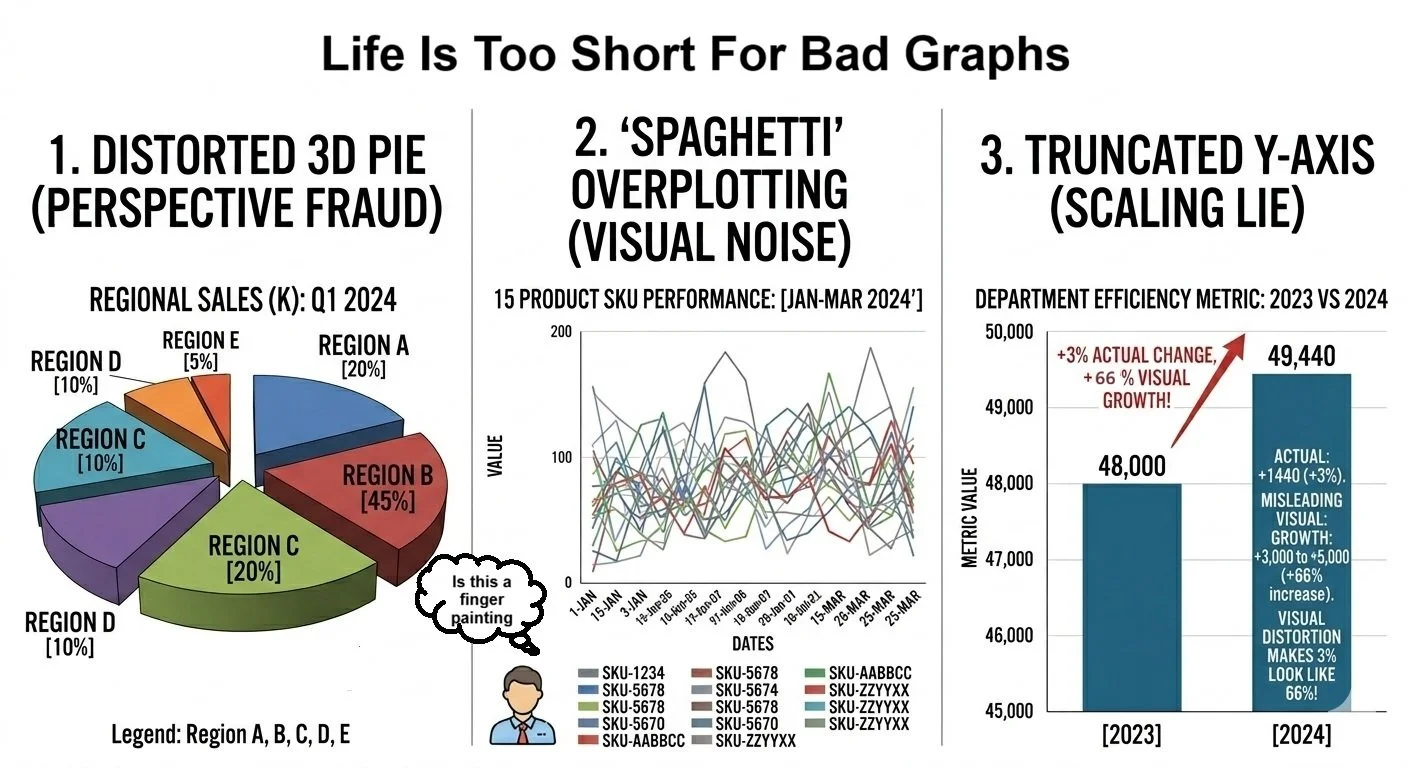
It has been said that a picture is worth a thousand words, but nobody even said those pictures couldn’t lie like a bad poker player. We are inundated with the ability to crank out charts, but what exactly are these charts telling us. One downside of our super-computing power is that data visualization is often treated as an afterthought. Modern tech (and AI) can crank out charts that are technically correct, yet still somehow be misleading at best and downright incorrect at worst. Here are a couple of examples why smart data visualization matters. Good graphs can be the difference between data that can provide a solid roadmap for decision making and data that is technically correct but will send you down a dead-end street.
If you have AI check the first pie chart, it should pass no problem because the chart is technically correct from a data perspective. This issue is that somebody opted for the cool 3-D perspective in visualization. As a result, the Region C data slice looks bigger proportionally than it actually is. Without comparing the numbers and the slice sizes, you would think Region C is the largest slice when in fact it is Region B.
I don’t think I really need to comment on the plate of spilled spaghetti that is chart #2, but it is a perfect example of chart scope-creep. I have been asked to produce too many of these in my time. Here, 17 different departments added a data point they wanted to track over time compared to the other 16 data points. While having 17 data points to benchmark might be a good idea in theory, as you see it winds up looking like a first-grade finger painting.
And finally, it looks like the second bar in chart #3 is a vast improvement over the first bar. Researchers have a natural tendency to accentuate the changes. Here we see a vast difference from 2023 to 2024. If this chart were to be handed to me, I would be pleased with the apparent great improvement that took place. The problem is that there was only a minimal change because these charts are not grounded to a zero axis. So, while the actual change is 3% (48K to 49.4K), it looks like over 60% because by starting the scale at 45K, it now visualizes a 0-5 scale rather than 0-50K scale. And this is how you make an actual 3% change look like a 66% change. So again, the numbers are correct, but the picture is misleading.
These charts are a few reminders that we need to be vigilant as data consumers since the pictures don’t always show the true story, and us CX data pushers need to be sure we don’t let the data overtake the story. The numbers want to tell the truth; but sometimes we need to get out of the way and let it tell its story.